Overview
Qt-UI StyleKit Overview
StyleKit is a QSS and icon style package for Qt Widgets projects. It helps teams standardize common controls such as buttons, inputs, tables, menus, dialogs, scroll bars, and toolbars.
Use Cases
- Unify the visual style of existing Qt applications.
- Establish a reusable UI baseline for new products.
- Provide consistent styling for industrial software, business systems, and data dashboards.
What It Includes
- Multiple QSS theme directions.
- Common widget state coverage.
- Icon assets aligned with control sizing.
- Theme variables and color usage guidance.
Integration
Most projects only need to load the required QSS file and follow the documented object names, dynamic properties, or state conventions.
Quick Start
Quick Start
- Copy the selected StyleKit theme files into your Qt project resources or deployment directory.
- Load the QSS file when the application starts.
- Apply the documented object names or dynamic properties to controls that need variants.
- Keep business UI code focused on layout and behavior; avoid hard-coded colors in pages.
QFile file(":/themes/stylekit/light.qss");
if (file.open(QIODevice::ReadOnly)) {
    qApp->setStyleSheet(QString::fromUtf8(file.readAll()));
}
Common Calls
| Method | Description | Parameters | Return |
|---|---|---|---|
QFile file(path) |
Creates a file object for the QSS file. | path: QSS resource path or local file path. |
QFile object |
file.open(QIODevice::ReadOnly) |
Opens the QSS file for reading. | Open mode flags. | bool |
file.readAll() |
Reads the full QSS content. | None. | QByteArray |
QString::fromUtf8(data) |
Converts UTF-8 QSS bytes into a QString. |
data: QSS byte content. |
QString |
qApp->setStyleSheet(qss) |
Applies the stylesheet to the whole Qt application. | qss: stylesheet text. |
void |
Use one theme as the baseline first, then add project-specific overrides in a small separate QSS file.
Usage Guide
Usage Guide
StyleKit is organized around standard Qt selector usage, object names, and dynamic properties.
Recommended Workflow
- Load the base QSS once during application startup.
- Use object names for stable semantic roles such as
primaryButtonorsidePanel. - Use dynamic properties for variants such as
type=primary,danger=true, orcompact=true. - Refresh the style after changing dynamic properties at runtime.
button->setProperty("type", "primary");
button->style()->unpolish(button);
button->style()->polish(button);
button->update();
Common Calls
| Method | Description | Parameters | Return |
|---|---|---|---|
qApp->setStyleSheet(qss) |
Applies or replaces the global application stylesheet. | qss: stylesheet text. |
void |
setProperty(name, value) |
Sets a dynamic property used by QSS selectors. | name: property name; value: property value. |
bool |
style()->unpolish(widget) |
Clears the current style cache for a widget. | widget: target widget. |
void |
style()->polish(widget) |
Recalculates the widget style. | widget: target widget. |
void |
update() |
Requests repaint after a runtime style change. | None. | void |
Maintenance Notes
Keep product-specific overrides small. If a color or spacing rule is reused by multiple pages, promote it into the theme layer instead of copying it into page code.
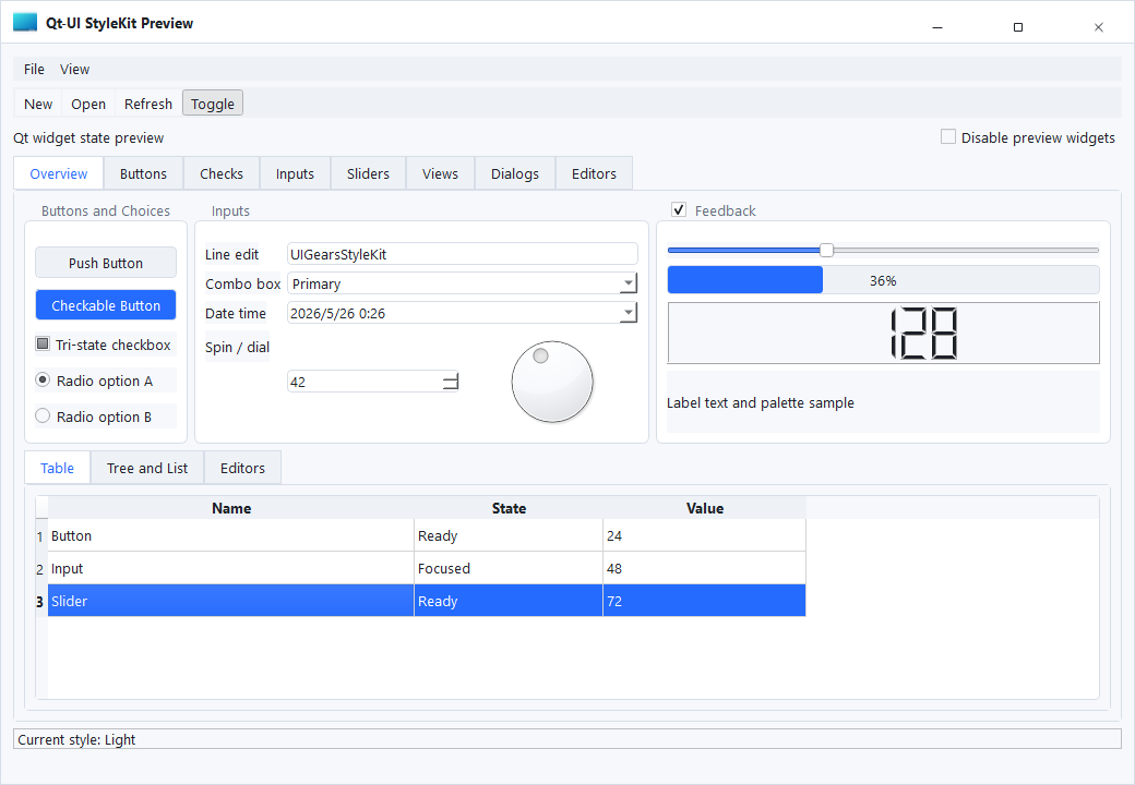
Style Preview
Style Preview
StyleKit previews show the visual baseline of each QSS theme. Use these screenshots to compare control density, color direction, border hierarchy, and state readability before choosing a project theme.
Absent Light
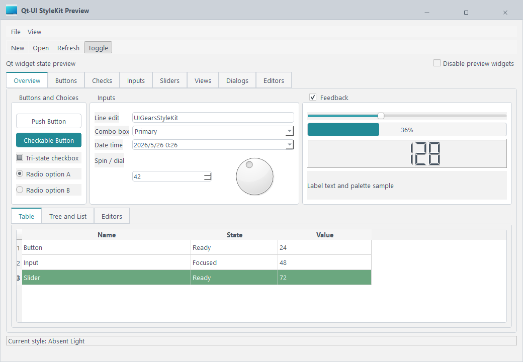
A clean and lightweight theme for business backends, forms, and compact information screens.
Tags: Light, Clean
Arduino
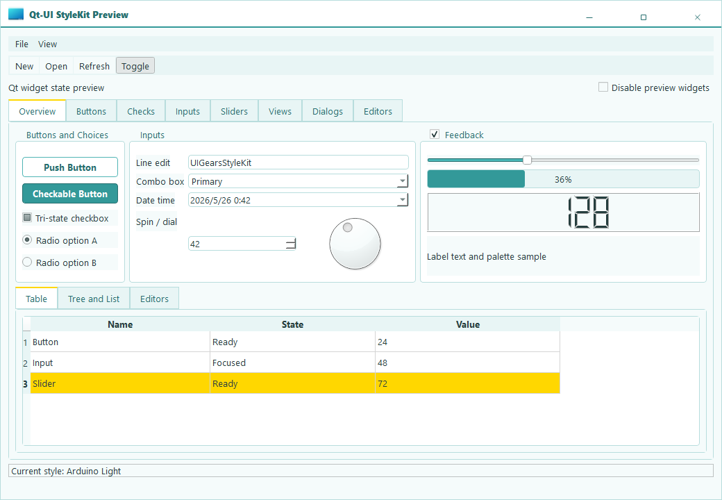
A bright hardware-tool inspired theme for device panels, control pages, and technical tools.
Tags: Light, Tooling
Ayu Bordered
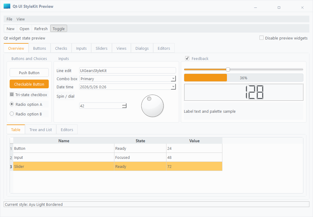
A light theme with clearer borders and stronger hierarchy for dense data pages and configuration panels.
Tags: Light, Bordered
Blue Light
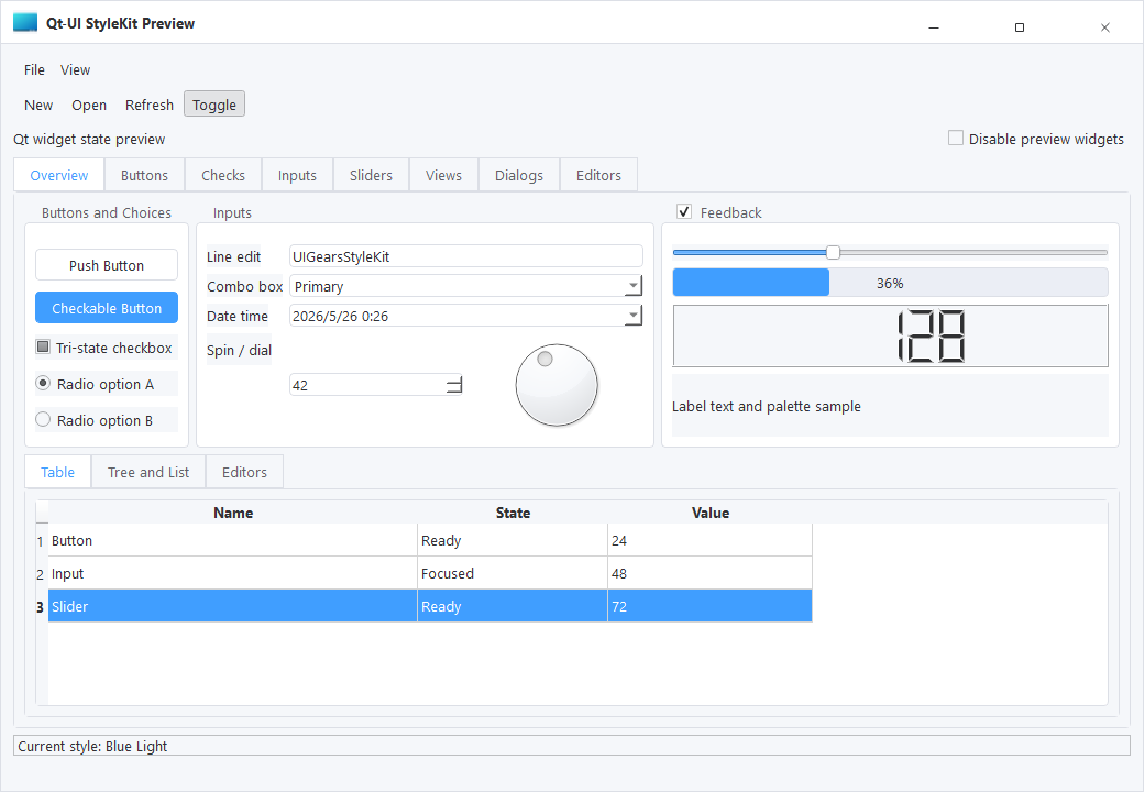
A business-blue light theme for enterprise management systems, workspaces, and workflow pages.
Tags: Light, Business
Common Light
A general light baseline for standard tools, admin pages, and quick project integration.
Tags: Light, General
Horizon
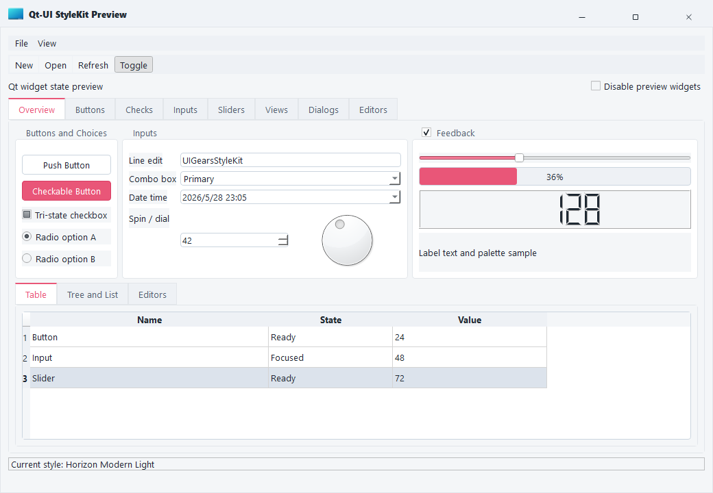
A softer visual direction with gentle color transitions for content-heavy desktop software.
Tags: Light, Soft
Monochromator
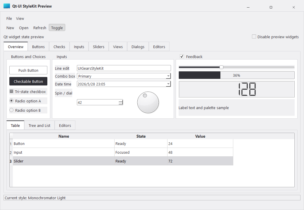
A structured monochrome style for professional tools, parameter pages, and hierarchy-focused interfaces.
Tags: Light, Monochrome
Neon Green
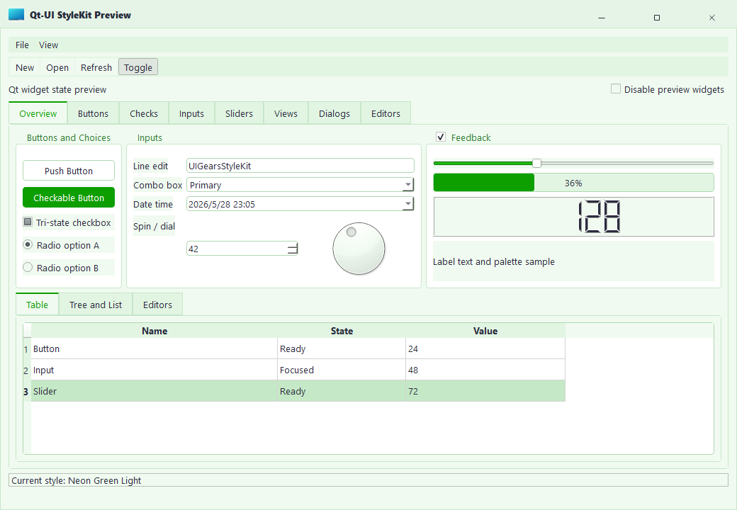
A high-recognition light theme for status monitoring, lab tools, and feedback-heavy interfaces.
Tags: Light, Accent
Purple Blue
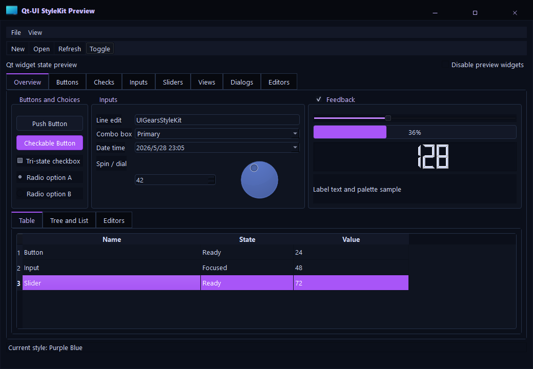
A modern blue-purple visual direction for branded desktop products and product backends.
Tags: Light, Brand
Tokoy Light
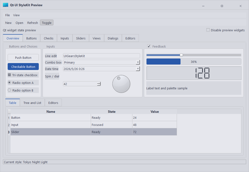
An expressive light theme for product dashboards and creative tool pages.
Tags: Light, Expressive
VS17 Dark
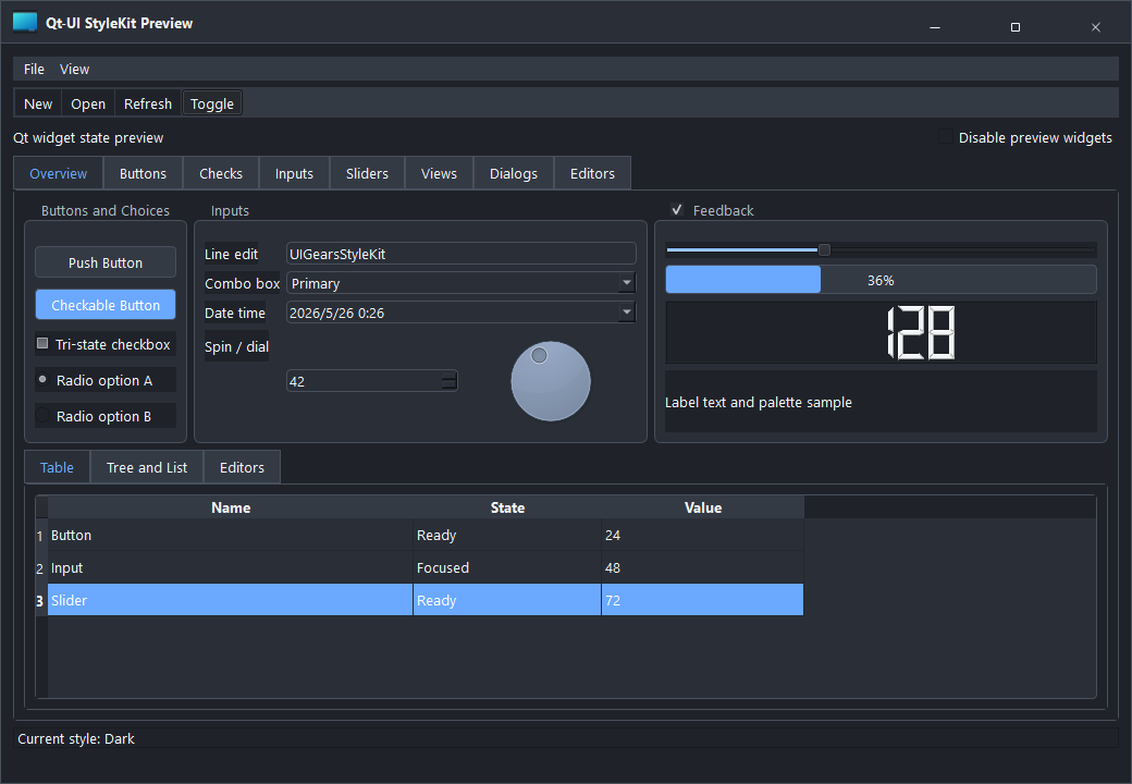
A dark developer-tool style for industrial software, monitoring pages, and focused workspaces.
Tags: Dark, Studio
VS17 Light
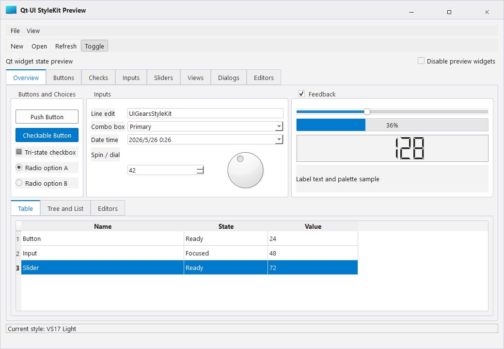
A bright developer-tool style for engineering desktop software and multi-panel layouts.
Tags: Light, Studio
QSS Structure
QSS Structure
StyleKit themes are split by responsibility so they are easier to maintain.
Typical Structure
base.qss: global defaults, fonts, colors, and base widget behavior.controls.qss: buttons, inputs, tables, menus, dialogs, and scroll bars.layout.qss: panels, cards, sidebars, and page containers.icons/: icon resources used by controls and pages.
Naming Guidance
Use stable semantic names instead of page-specific names. For example, primaryButton, warningText, and panelSurface age better than names tied to one screen.
Theme Variables
Theme Variables
StyleKit uses documented color and spacing roles to keep themes consistent.
Common Roles
- Background: main application surfaces and page backgrounds.
- Surface: cards, panels, menus, and popups.
- Text: primary, secondary, disabled, and inverse text.
- Accent: primary actions and selected states.
- Danger/Warning/Success: semantic status colors.
- Line: borders, dividers, and table grid lines.
When adding a theme, keep contrast and disabled states readable. Avoid changing only the main color while leaving hover, pressed, and focus states inconsistent.
Icon Usage
Icon Usage
StyleKit icons are intended to match the control size and state system.
Guidelines
- Prefer SVG icons for scalable UI.
- Keep icon sizes aligned with the control height.
- Use consistent stroke width across toolbars and action buttons.
- For stateful controls, define normal, hover, pressed, checked, and disabled colors.
When icons are used inside buttons, let the button theme control the visual state whenever possible.
License
License
StyleKit provides community and commercial editions.
Community Edition
Suitable for learning, prototypes, and non-commercial evaluation.
Commercial Editions
Annual and perpetual licenses can be used in commercial projects. Commercial packages include the corresponding source/assets and update rights according to the purchased plan.
Actual licensing scope follows the order and agreement at purchase time.