Style Preview

Style Preview

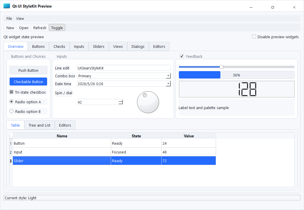
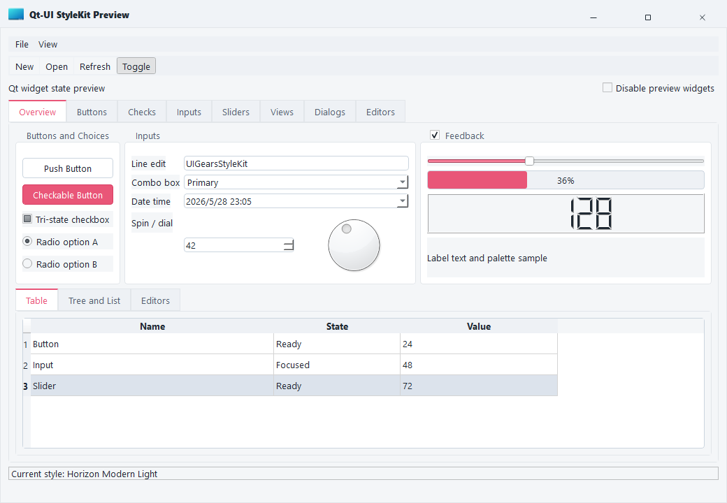
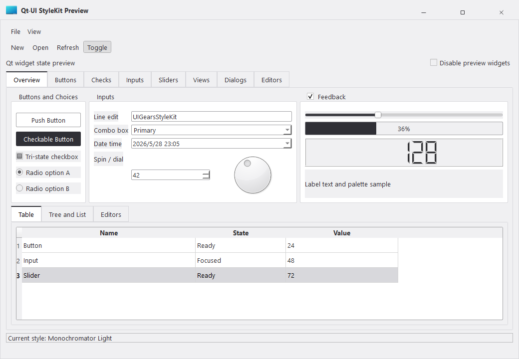
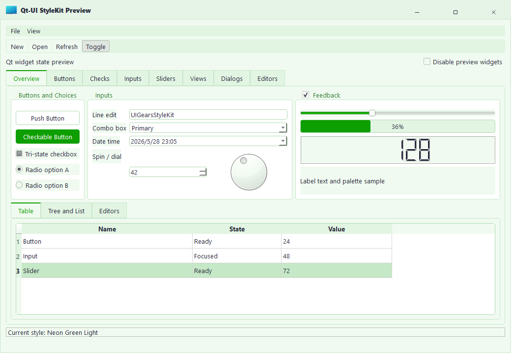
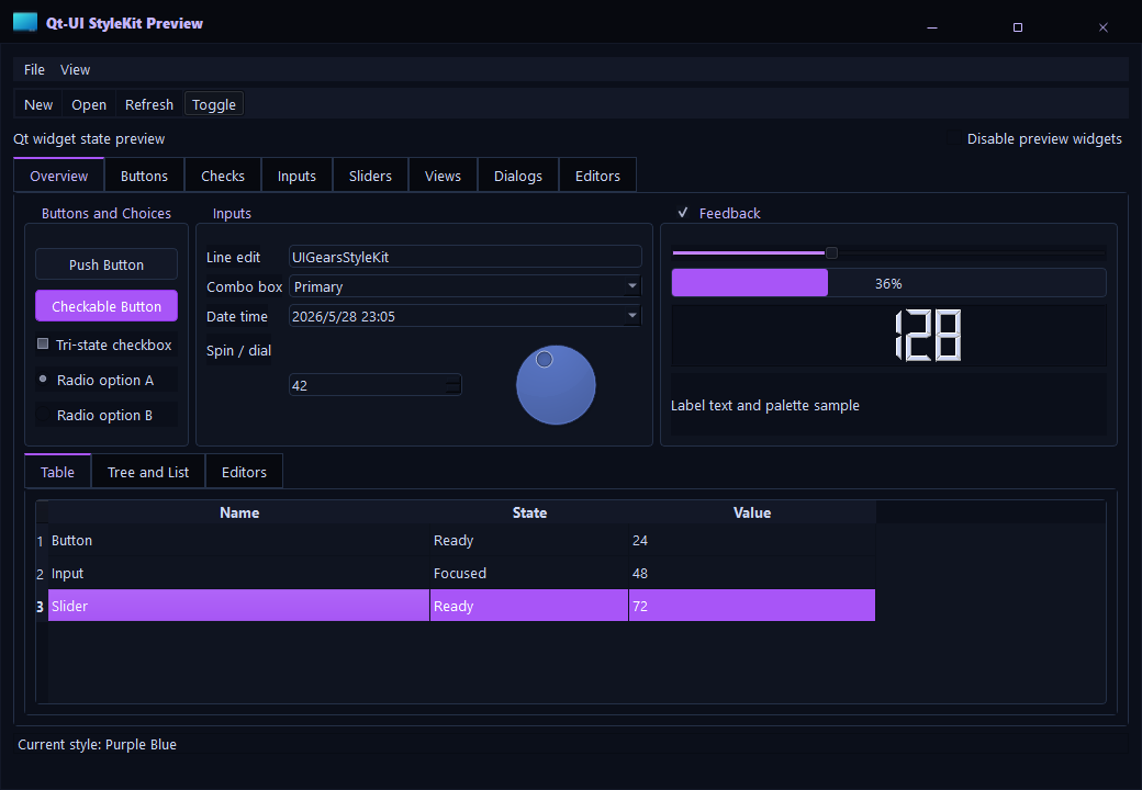
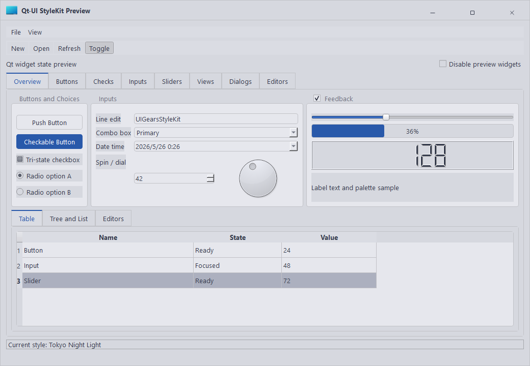
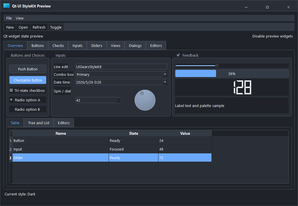
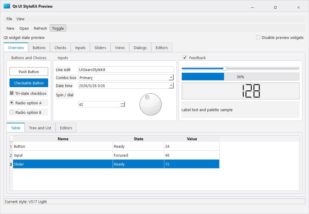
StyleKit previews show the visual baseline of each QSS theme. Use these screenshots to compare control density, color direction, border hierarchy, and state readability before choosing a project theme.

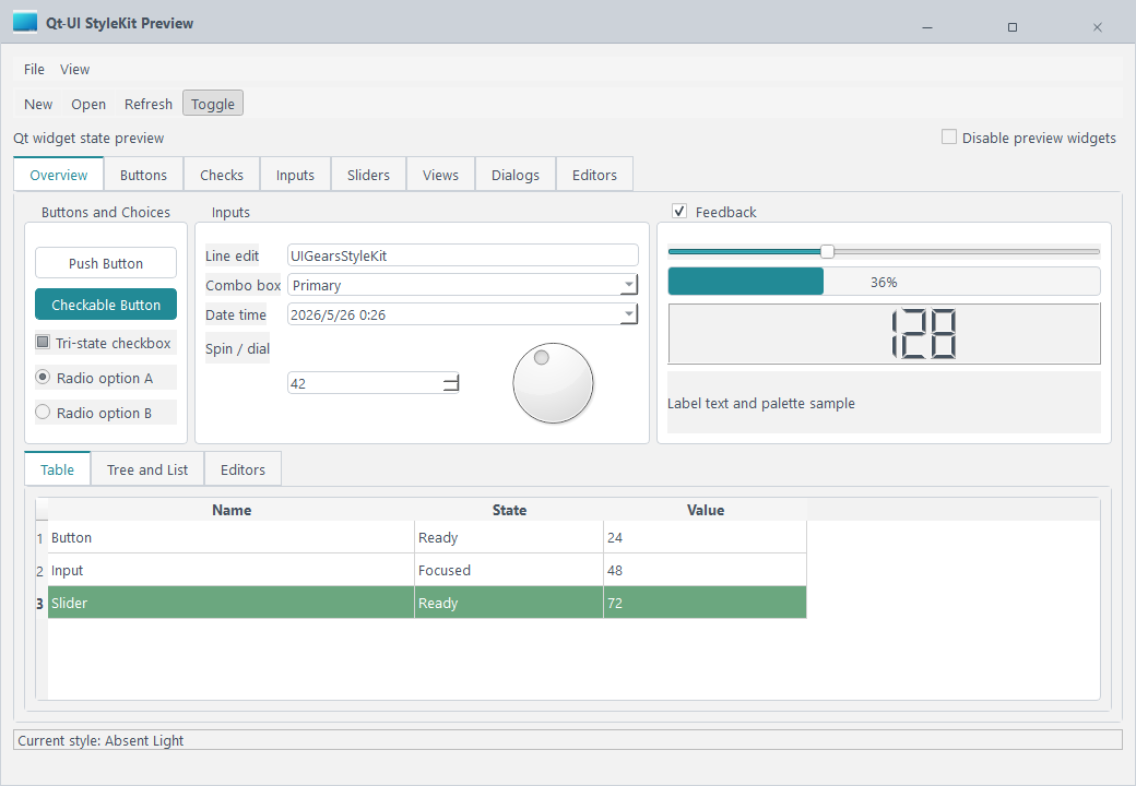
Absent Light

Absent Light

A clean and lightweight theme for business backends, forms, and compact information screens.

Tags: Light, Clean

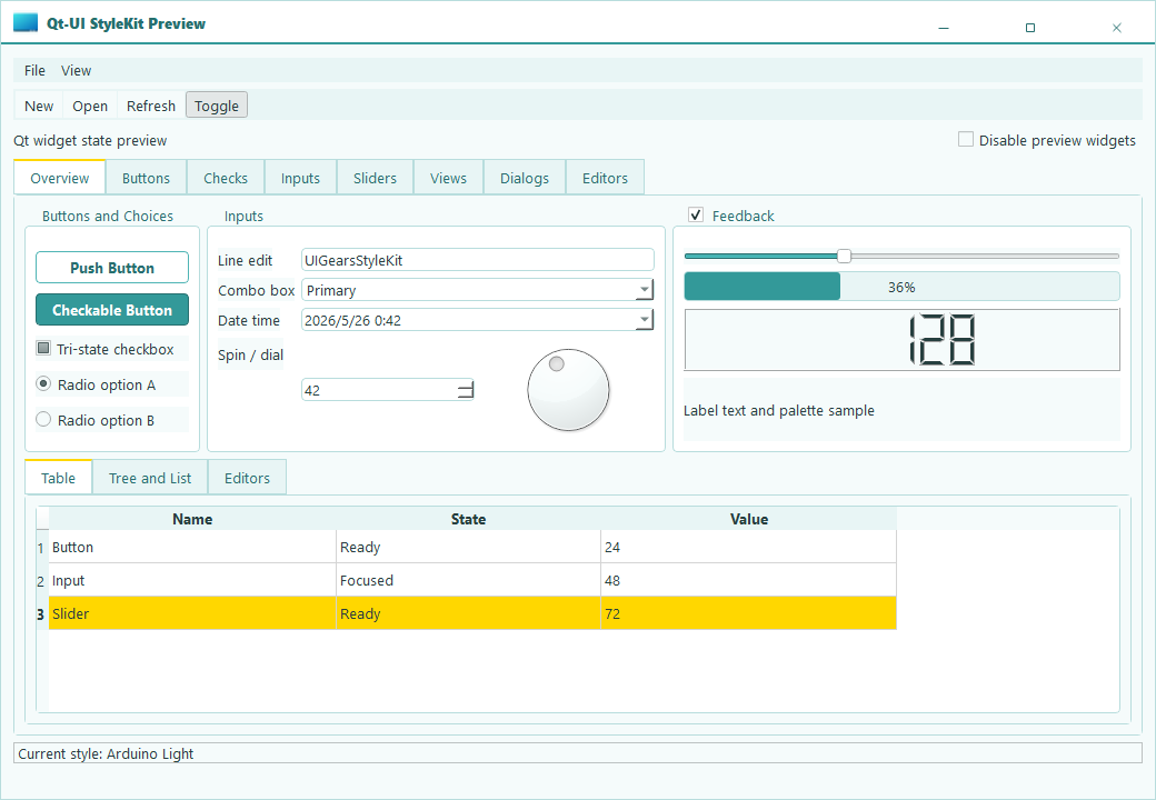
Arduino

Arduino

A bright hardware-tool inspired theme for device panels, control pages, and technical tools.

Tags: Light, Tooling

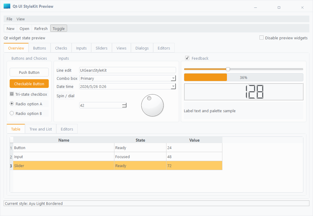
Ayu Bordered

Ayu Bordered

A light theme with clearer borders and stronger hierarchy for dense data pages and configuration panels.

Tags: Light, Bordered

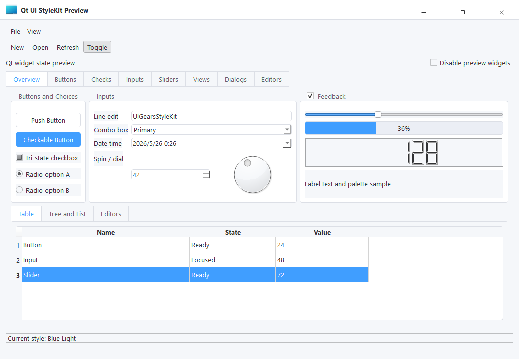
Blue Light

Blue Light

A business-blue light theme for enterprise management systems, workspaces, and workflow pages.

Tags: Light, Business

Common Light

Common Light

A general light baseline for standard tools, admin pages, and quick project integration.

Tags: Light, General

Horizon

Horizon

A softer visual direction with gentle color transitions for content-heavy desktop software.

Tags: Light, Soft

Monochromator

Monochromator

A structured monochrome style for professional tools, parameter pages, and hierarchy-focused interfaces.

Tags: Light, Monochrome

Neon Green

Neon Green

A high-recognition light theme for status monitoring, lab tools, and feedback-heavy interfaces.

Tags: Light, Accent

Purple Blue

Purple Blue

A modern blue-purple visual direction for branded desktop products and product backends.

Tags: Light, Brand

Tokoy Light

Tokoy Light

An expressive light theme for product dashboards and creative tool pages.

Tags: Light, Expressive

VS17 Dark

VS17 Dark

A dark developer-tool style for industrial software, monitoring pages, and focused workspaces.

Tags: Dark, Studio

VS17 Light

VS17 Light

A bright developer-tool style for engineering desktop software and multi-panel layouts.

Tags: Light, Studio